CONTEXT, CONSTRAINTS & GOALS
CONTEXT
At a major international motorshow, Mazda faced a structural limitation:
only a small portion of the product lineup could be physically showcased.
Eight new models were launching that year, yet only three vehicles fit on the stand.
Visitors had no way to explore unavailable models, compare trims, or check pricing. Most left having seen only what happened to be on display.
Sales advisors were overwhelmed. High inquiry volume turned simple questions into long waiting times. Many visitors disengaged within minutes, often moving directly to competing brands.
The physical stand couldn't scale. The system had to.
Rather than improving the interface, the goal was to:
- Reduce dependency on sales advisors.
- Enable independent decision-making.
- Accelerate conversion in high-pressure environments.
CONSTRAINTS
The motorshow context imposed strict operational and technical constraints that directly shaped the solution.
This wasn’t a UI problem.
It was an adoption problem.
Environmental constraints:
- High-traffic, high-distraction public space.
- Extremely short attention windows.
- Strong privacy concerns when sharing personal data.
- Multi-day event with zero tolerance for instability.
Technical constraints:
- iPad-only deployment, no App Store distribution.
- Unreliable or unavailable internet connectivity.
- Offline-first performance across multiple devices.
- Secure lead capture through deferred, device-to-device handoff.

Success was measured by conversion,
not aesthetic polish.

System failure
The system wasn't broken.
It was misaligned with how decisions actually happen.
- Waiting killed conversion.
- Information delays broke decision momentum.
- Public data entry blocked completion.
The system was optimized for browsing.
The environment required decision readiness.
Role & Scope
My Role
I led UX and UI design end-to-end, working directly with business, engineering, and on-site operations to ship a production-ready system for the event.
- Research & behavioral validation.
- Strategy & decision design.
- System & interface architecture.
- Technical alignment & delivery.
- On-site system validation.
Human & System Insights
What changed wasn’t preference, it was behavior under pressure.
Decision making shortens.
Privacy concerns intensify.
Patience disappears.
Rather than relying on stated preferences, research focused on observed behavior. Three insights consistently emerged.
Insight 1:
Visitors Avoid Waiting
Sales advisors were overwhelmed.
Simple questions required 10–15 minutes of waiting.
In high-traffic environments, waiting isn’t neutral friction.
It’s a conversion killer.
Insight 2:
Information Is Expected Immediately
Visitors repeatedly asked the same questions:
- “What colors does this model come in?”
- “How much is the GT version?”
They expected instant answers, not mediated conversations or delayed lookups.
Information delays break momentum at the exact moment decisions are forming.
Insight 3:
Public Forms Felt Exposing
During testing, participants physically shielded the screen.
Visible hesitation appeared when entering personal data.
Privacy concerns weren’t theoretical.
They were immediate, embodied, and visible.
In public spaces, privacy isn’t a preference.
It’s a prerequisite.
Experience Principles
Highlight top-selling models first, with full access available for deeper exploration, without forcing users to process everything at once.
Speed over completeness
Enable quote requests in three taps, optimized for fast decisions rather than long sessions.
Privacy by design
Allow sensitive data entry to continue privately via QR, away from the public space. Privacy treated as a prerequisite, not a feature.
Decision mechanism
It was a system to accelerate decisions under time pressure.
Compare → Select → Validate → Quote
The goal wasn't to show everything.
It was to help users decide faster.
ITERATION UNDER REAL CONSTRAINTS
Design decisions were validated through testing in real-world conditions, not labs, but high-distraction public environments.
- On-device quote flow vs. QR continuation.
- Navigation patterns for different intent levels.
- Completion time under pressure.
- Error handling in offline scenarios.
The experience wasn’t designed for ideal conditions.
It was shaped by the reality of the event.
A/B Testing 1: Privacy vs. Friction
Question
Would visitors feel comfortable entering personal data on a shared tablet in a crowded, public environment?
Hypothesis
Respecting privacy would increase completion, even if it added an extra step.
Test
Guerrilla testing in a public shopping mall simulating motorshow conditions.
- 40 participants.
- Tablet mounted with full public visibility.
- Two flows rotated equally.
A
On-device form
Complete quote directly on tablet

B
QR continuation
Continue privately on personal phone

Results
- 45% actively chose the QR continuation.
- +30% faster completion via phone.
- Higher overall completion when both options were available.
Observed behavior
- Users physically shielded the screen.
- Visible hesitation appeared when entering personal data.
Decision
Remove privacy as a conversion blocker.
Ship both flows.
Why it worked
Privacy isn’t a feature. It’s a threshold.
When users feel exposed, they don’t convert. When they feel safe, they complete.
A/B Testing 2:Exploration vs. Efficiency
Question
How do people navigate in a public, high-distraction environment?
Hypothesis
Sequential navigation helps discovery.
But it slows intent-driven users.
Test
Task-based testing in a public setting.
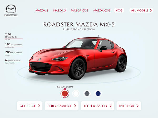
Scenario:“Find the Mazda CX-5 and check its price.”
A
Sequential, arrow-only navigation
Arrow-only browsing, step-by-step
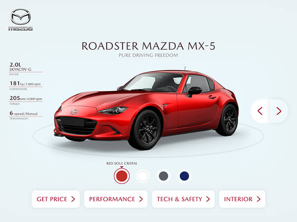
B
Direct access menu + “All Models”
Menu + “All Models” entry point
Results
- 70% faster goal completion with direct access.
- Two distinct behavioral patterns emerged.
Observed behavior
Intent-driven users skipped browsing and searched immediately. Exploratory visitors preferred guided, step-by-step discovery.
Decision
Don’t force a single path.
Design for intent.
Why it worked
Navigation isn’t about hierarchy.
It’s about intent.
Different users arrive with different levels of intent.
The system needs to adapt, not force alignment.
UX PRINCIPLES APPLIED
Two entry points coexisted: direct model access for intent-driven visitors, guided browsing for exploratory ones. A/B test 2 confirmed that forcing a single path penalizes half your users.
Speed over completeness → Three-tap quote flow
The critical path was ruthlessly shortened. Every additional step was treated as a conversion risk. Quote requests were designed to complete in three taps with no dead ends.
Privacy by design → Dual quote flows
A/B test 1 confirmed the hypothesis: offering QR continuation as an option, not a default, respected autonomy while removing the friction that blocked completion. Both flows shipped.
Scalable Interface System
- Scaled from 3 to 8 models without refactoring.
- Absorbed pricing changes and new trim levels.
- Maintained structure across multiple events.
The strongest validation wasn’t the first event. It was that Mazda didn’t redesign for the next two.
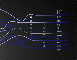
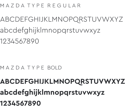
TYPOGRAPHY
COLORS

COMPONENTS
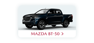
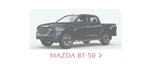
NAME
STATE DEFAULT
STATE PRESSED












INTERACTION

Impact at Scale
+35%
Lead capture
across the event
+25%
Test-drive
conversion rate
The system was deployed across three consecutive motorshow editions without structural redesign.
Models changed.
Pricing evolved.
Content updated.
The architecture held every time.
Mazda didn’t redesign.
The system held.
Final Insight
The interface improved.
The system held.
Across three events, nothing had to be rebuilt.
When the structure holds as complexity grows,
design stops being visual, it becomes systemic.