CONTEXT, CONSTRAINTS & GOALS
Inconsistency wasn't only visual. It affected recognition and trust.
Users don't evaluate interfaces. They evaluate trust signals.
When those signals are inconsistent, trust weakens and friction increases during interaction.
Banco de Crédito del Perú (BCP), one of Peru’s largest banks, operated across multiple digital products, teams, and touchpoints. Each team moved fast but independently, making decisions in isolation without shared operational coordination.
Over time, this created a fragmented ecosystem where:
- Interfaces looked and behaved differently.
- Components were rebuilt instead of reused.
- Trust signals became inconsistent.

The problem wasn't lack of design.
It was lack of alignment.

The objective
- Establish trust signals across digital channels.
- Standardize visual and interaction patterns.
- Reduce duplicated effort across teams.
- Increase delivery speed.
The bank didn't need another guideline.
It needed a shared foundation.
Independent
Guidelines
Fragmented
Experiences



The failure wasn't in execution, it was structural.
Teams optimized locally while the system degraded globally.
Role & Scope
Lead designer · System vision, evolution & scaling · 2016–2022
I led the definition of the system’s vision, structure, and adoption model, aligning design and engineering around a shared operating model that reduced reliance on isolated project-level decisions.
This did not begin as a product initiative. It emerged as a response to a systemic gap: teams were repeatedly solving the same problems, duplicating decisions and generating operational friction across products.
What started as a UI kit evolved into a shared system spanning platforms, teams, and workflows. I was directly involved in defining the initial architecture, component logic, and interaction patterns, ensuring the system was not only designed, but built to scale.
Fragmented Experiences




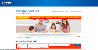


The work wasn’t about designing interfaces.
It was about designing a system that would define interfaces moving forward.
THE KEY SHIFT
It wasn't. It was trust recognition.
Users struggled to recognize consistent interaction patterns across platforms, creating friction and uncertainty.
The goal wasn’t visual consistency itself, but establishing reliable trust signals across the digital ecosystem.
Design stopped being a visual layer.
It became a system for recognition and trust.
HUMAN & SYSTEM INSIGHTS
Across projects, patterns of inconsistency appeared again and again.
Inconsistency wasn’t an individual decision. It was the result of working without a shared system.
Teams didn’t choose it. They fell into it under time pressure, fragmentation, and the absence of shared systems.
Insight 1:
Inconsistency weakens trust
In financial environments, consistency functions as a security signal.
Recognition reduces hesitation.
When users cannot recognize consistent patterns across interfaces, trust weakens and friction increases during interaction.
Insight 2:
Reinvention creates invisible cost
Time wasn’t lost designing features. It was lost rebuilding foundations and redefining decisions that had already been resolved elsewhere.
Every new initiative restarted work that had already been solved in another product.
- Repeated reconstruction of components and decisions already resolved in other products.
- Design decisions repeatedly redefined across projects.
- Progressive divergence across components, patterns, and experiences.
- Dependency on fragmented knowledge across teams.
Insight 3:
Systems succeed through adoption, not documentation
Documentation alone doesn’t change behavior. Adoption does.
Education became as critical as design.
A system that teams don't use is not a system.
It's a library.
Don't scale components.
Scale dependency.
SYSTEM THINKING
Before defining components or libraries, one question changed the direction of the work:
What actually makes something a system?
A system is not a collection of visual assets. It's a set of interconnected parts working together toward a shared goal.
Shared structure enables shared behavior, cross-functional coordination, and operational scalability.
Understanding this transformed the initiative from creating visual guidelines to designing interconnection across teams.
Like a nervous system coordinating movement across the body, the design system would connect principles, documentation, components, and workflows, allowing independent teams to move consistently without centralized control.
DESIGN PRINCIPLES
Three principles guided the adoption and governance of the system across the organization.
One Language, Many Products
Every interface should feel unmistakably BCP. Shared visual patterns reinforce recognition, trust, and consistency across all digital channels.
Reuse Before Reinvention
Components are long-term investments, not project deliverables. Reusable foundations reduce duplication and accelerate product delivery.
Contribution Over Centralized Control
The system evolves through shared ownership across teams. Distributed contribution allows the system to scale without becoming an operational bottleneck.
SYSTEM design
The system was structured to coordinate decisions across design, technology, and business through shared reusable foundations.
Designers reused system components and developers reused existing code by default. New requirements drove the collaborative creation of components, allowing teams to learn the system by applying it directly across projects.
Adoption was embedded into the creation of components and patterns, allowing teams to learn the system by using it and contributing to it through their projects.
This created a natural loop:
- Consume the system.
- Extend it collaboratively.
- Reinforce it through reuse.
Over time, not using the system
became visible and inefficient.
SYSTEM EVOLUTION
The system didn’t emerge fully formed. It evolved through several stages as the organization matured in how it structured and reused design decisions.
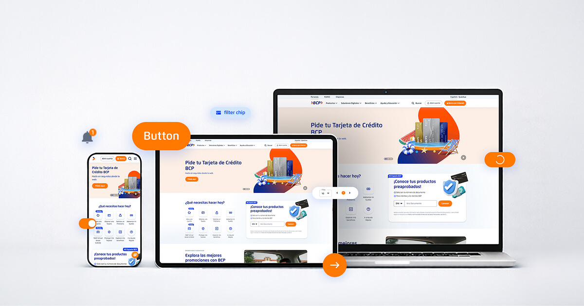
What began as isolated visual guidelines gradually evolved into a structured design system with semantic foundations, reusable components, and cross-platform scalability.
2016 - UI KIT
Tool: Adobe Illustrator
Early attempts to standardize visual elements across projects.
- Color styles defined as static values rather than semantic tokens.
- Visual guidelines documented but not connected to reusable foundations.
- Interaction states inconsistently defined across components.
- Components recreated manually across projects.
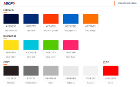


2018 - STYLEGUIDE
Tool: Sketch
Evolution toward a shared visual reference for design teams.
- Shared UI styles introduced across multiple projects.
- Component patterns documented but still loosely connected.
- Design decisions centralized in guidelines rather than reusable structures.
- Interaction states still inconsistently applied across products.




2020 - Design System (Conecto)
Tool: Sketch → Figma
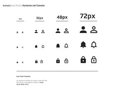
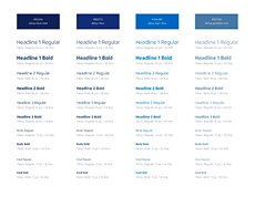
Evolution toward a scalable design system for multiple products.
- Semantic color tokens replacing static color values.
- Reusable component libraries shared across teams.
- Consistent interaction states defined system-wide.
- Foundations prepared for implementation across multiple platforms.
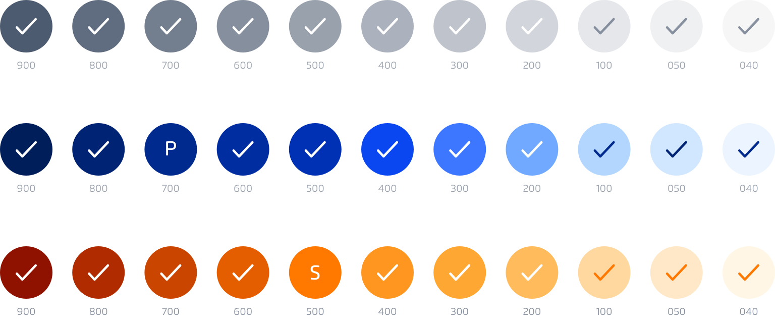
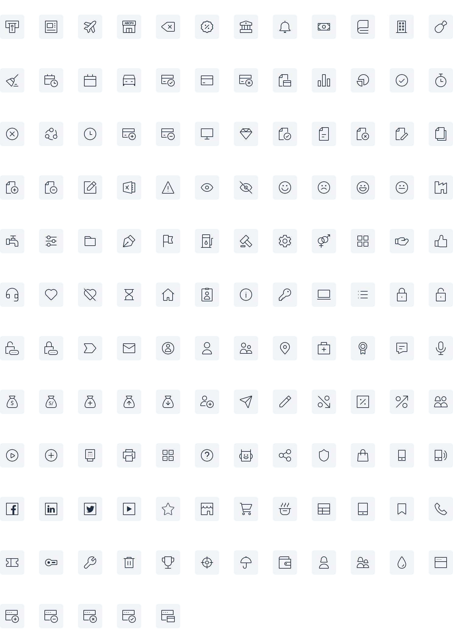
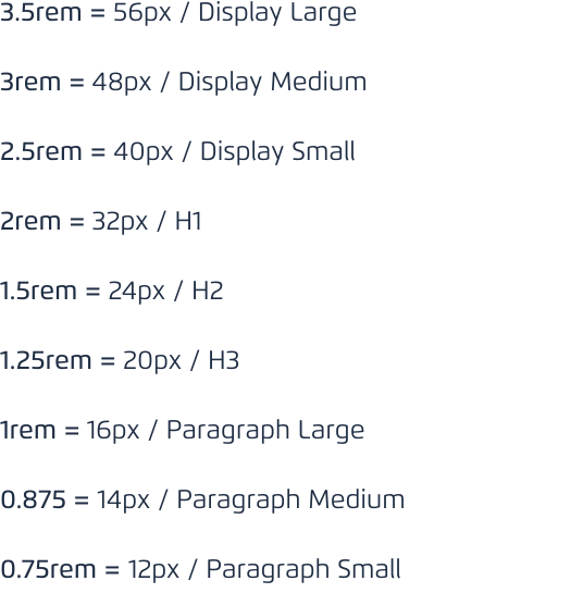
ATOMS

MOLECULES
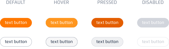
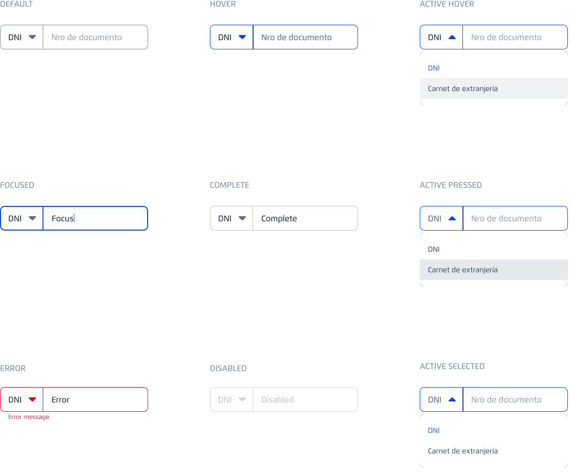
ORGANISM
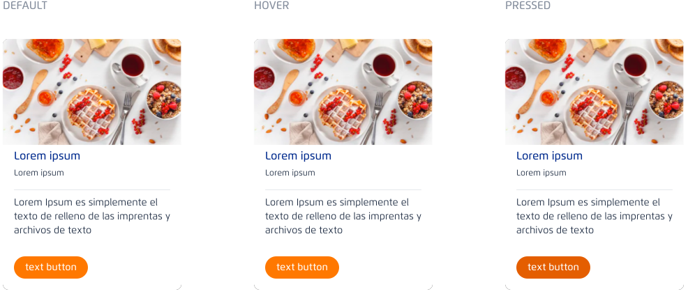
PRODUCTS

ITERATION UNDER REAL
ORGANIZATIONAL CONSTRAINTS
The system could not succeed through design alone. Its adoption depended on coordinated participation across design, engineering, and product teams, transforming how decisions were made and shared across the organization.
Adoption required more than tools. It required changing how teams collaborated, reused decisions, and coordinated work.
Teams first needed to understand how systems function and evolve.
This led to the design and leadership of structured training programs aimed at accelerating adoption, reducing fragmentation, and aligning UX, UI, Research, and Service Design teams around a shared operational logic.
- Centralized standards ensuring consistency.
- Federated contribution allowing teams to evolve components collaboratively.
The design system became a living ecosystem continuously improved by its users.
What we avoided
Early versions of the system showed the risk clearly. Teams treated it as a reference, not a dependency. Components were copied, modified, and drifted.
Within months:
- Variants multiplied.
- Reuse dropped.
- Inconsistency returned.
The system wasn't failing technically. It was becoming optional.
The solution was not enforcing adoption.
It was making the system
the most efficient way to work.
IMPACT AT SCALE
Unifying design and development decisions at scale.
+75%
Reduction in production time
Estimated metric calculated from average production times and component reuse across teams.
28
Products integrated into the Design System
- Reduced reconstruction of components and decisions already resolved in other products.
- Faster onboarding across design and development teams.
- Improved coordination and collaboration across product, design, and engineering.
- Operational scalability across multiple digital products.
- Shared adoption across product, design, and engineering teams.
2016 EXPERIENCE:
Legacy system: Pre-design system fragmentation
View legacy experience →
2026 EXPERIENCE
Design system applied across digital ecosystem.
View current experience →
Design shifted from production activity to strategic infrastructure.
Explore system evolution →SCALABLE SYSTEM
The strongest validation didn’t happen at launch. It happened over time.
New products appeared.
Teams evolved.
Technologies changed.
The system adapted without requiring redesign.
Components scaled without requiring constant redefinition across products.
Knowledge persisted.
Consistency held.
What started as a UI initiative became organizational infrastructure
FINAL INSIGHT
When inconsistency becomes risk,
design becomes infrastructure.
At scale, trust stops being visual.
It becomes behavioral.