TheSIS
Most design problems aren't caused by bad taste.
They're caused by the absence of a shared method to translate research into visual decisions.
Across projects, the same pattern appeared:
- Teams designed in isolation
- Decisions driven by opinion
- Built systems that collapsed at scale.
The root cause wasn't skill. It was the lack of a translation layer between what research revealed and what the interface needed to do.
This framework emerged as a way to structure that translation.
Why demographics fail
The instinct is to start with who users are. Age, gender, and personas feel like a foundation.
Across projects, they consistently failed to explain the decisions that actually mattered:
- Layout density.
- Affordance level.
- Icon complexity.
- Interaction patterns.
A 35-year-old and a 65-year-old can share identical usage contexts. A persona labeled "tech-savvy" can behave with hesitation in a high-anxiety environment.

Demographics describe users.
Context explains behavior.

The shift
Once the question changed from who are the users to how do they use this product, design decisions became clearer, faster, and easier to defend.
Behavioral patterns, context of use, interaction frequency, anxiety level, and expertise levels predicted visual needs with far more precision than any demographic profile.
BEFORE
- Opinion-driven decisions.
- Subjective debates.
- Systems that collapsed at scale.
AFTER
- Behavioral inputs.
- Consistent interface decisions.
- Visual systems with defensible logic.
What worked every single time I measured was context. Behavioral context became the foundation for transforming research into consistent interface decisions.
Framework Overview
This didn't emerge as a model.
It emerged as a pattern.
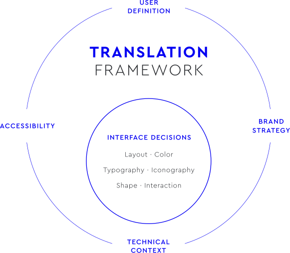
The framework is built around four interconnected dimensions.
Individually, each one informs design decisions.
Together, they form a translation layer between research and interface decisions.
They reduce the space where opinion normally lives and allow decisions to emerge from context rather than individual preferences.
1. USER DEFINITION
How people actually use the product, not who they are. The key shift: behaviors, not profiles.
Maps:
- Context of use → layout density.
- User goals → hierarchy and emphasis.
- Expertise level → affordance.
- Frequency → icon familiarity.
Outputs:
- Layout structure.
- Interaction patterns.
- Component hierarchy.
- Icon strategy.
2. BRAND STRATEGY
How the product should be perceived.
Brand isn’t decoration. It’s an input.
Maps:
- Positioning → color strategy.
- Brand personality → typography tone.
- Differentiation → shape language.
Outputs:
- Color palette.
- Type scale.
- Component shapes.
- Visual tone.
3. TECHNICAL CONTEXT
What can realistically be built and maintained. Some designs fail not because they’re wrong, but because they’re impossible.
Maps:
- Platform & devices → responsive behavior.
- Performance constraints → visual complexity.
- Input methods → interaction patterns.
Outputs:
- Grid system.
- Touch target specs.
- Performance guidelines.
4. ACCESSIBILITY
Who gets excluded if we’re not careful.
The most expensive fixes I’ve seen came from treating accessibility as a final check.
Maps:
- Contrast requirements → color decisions.
- Navigation needs → keyboard & screen reader support.
- Cognitive load → labeling and patterns.
Outputs:
- Accessibility tokens.
- ARIA guidelines.
- Navigation rules.
INTERFACE DECISIONS
When the four dimensions operate together, the translation materializes as consistent interface decisions:
- Layout
- Color
- Typography
- Iconography
- Shape
- Interaction
These decisions become less dependent on individual preferences and begin to emerge from the needs of the context.
Framework in Practice
The principles behind this framework were validated through work on real self-service systems.
The original system was visually functional, but did not respond to real user behavior.
Despite being technically complete, it required frequent staff assistance and created friction, particularly for older adults and infrequent digital users.
Observed failure patterns:
- Users hesitating before interaction.
- Dependence on branch staff to initiate tasks.
- Cognitive overload from unclear hierarchy and interaction cues.
- Low confidence during self-service processes.
Design decisions were interface-driven, not behavior-driven.
The interface worked. The system didn’t.

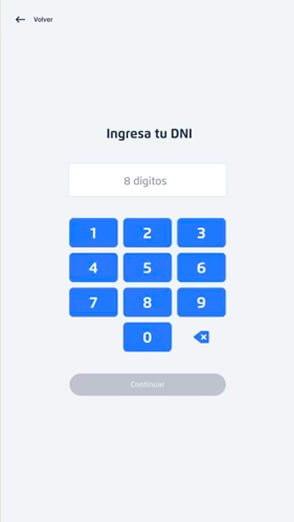
Visual decisions produced
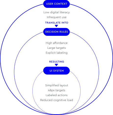
- Increased spacing and simplified layout density.
- High-affordance interaction patterns.
- Clearly labeled actions and simplified iconography.
- Large touch targets, 48×48px minimum.
- High-contrast, calming visual hierarchy.
The goal shifted from aesthetic optimization to interaction
confidence and autonomy.
Applied in Real Product
Behavioral outcome: Increased user autonomy

The framework defines interface decisions built from observable behavior in real products.
In this case, the redesign enabled a shift from assisted interaction to more autonomous self-service.
Strong adoption among older adults validated the accessibility-driven decisions. The redesign shifted behavior from assisted interaction to autonomous self-service.

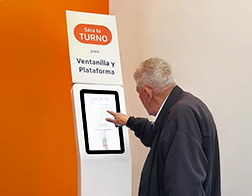
Observed real interaction after redesign
Users independently completed the full self-service flow without staff assistance, validating the interface decisions defined by the framework through observable behavior.
IMPACT
For users:
- Increased confidence and reduced anxiety.
- Accessible interaction across age groups.
- Faster task completion.
For operations:
- Reduced staff dependency.
- Lower onboarding friction.
- More scalable self-service adoption.
Self-Service Banking Kiosk
Research, redesign, and measurable impact.
Why it works
For Teams → Shared vocabulary
- Faster decisions.
- Fewer subjective debates.
- A common language between research, design, and engineering.
For Products → Visual coherence at scale
- Accessibility built in from the start.
- Clear brand expression.
- Systems that don't collapse at 100 screens.
For Organizations → Reduced rework
- Easier onboarding.
- Systems that can evolve without rebuilding foundations.
What I learned
The biggest design risk isn’t bad taste, it’s untested assumptions.
Context consistently outperformed demographics. The instinct to rely on profiles is understandable, but the evidence pointed elsewhere.
Frameworks don’t replace judgment. They make trade-offs explicit and conversations better.
A framework is a shared starting point, not a guarantee of good decisions.
Where it works and where it doesn't
This framework isn't universal.
Works best for:
- Products with clearly observable usage contexts.
- Teams building or scaling design systems.
Less effective for:
- Highly experimental work.
- Short-lived marketing sites.
- Early product-market fit exploration.
Contexts where behavioral patterns
haven't yet stabilized require different methods.
Final insight
Without a translation layer between research and UI, design decisions remain subjective.
When behavioral context is transformed into interface decisions, usability improvements emerge not as aesthetic changes but as measurable human outcomes.
Impact showed up in decision quality, not pixels.