CONTEXT, CONSTRAINTS & GOALS
Queue management in bank branches is not a digital problem. It's a behavioral system operating inside a physical environment.
Customers depended on staff to understand where to request their turn, which service to select, when they would be called, and where to go.
This dependency increased operational load, slowed in-branch service flow, and generated friction across every interaction point.
At scale, the issue was not interface design. It was how the system communicated its logic to people inside the physical space.
The objective
- Enable customer self-service for turn registration.
- Reduce staff dependency in queue management.
- Improve understanding of the queue system.
- Standardize the experience across 370 branches.
- Reduce operational workload without increasing cognitive complexity.
Role & Scope
Principal Product Designer. Field research inside branches
What started as an interface problem became a systemic coordination challenge across digital experience, branch operations, and physical touchpoints.
- Field research inside branches.
- Behavioral analysis of queue interactions.
- Turn management system definition.
- Kiosk interaction flow design.
- Turn display interface design.
- Usability testing & pilot validation.
- Implementation handoff & rollout.
THE KEY SHIFT
At first, the problem looked like an interface issue. Customers were struggling to use the kiosk system.
But the real issue was not usability.
It was system legibility.
Customers could not easily understand how the queue worked, and as a result, the interface itself became difficult to interpret.
Without that understanding, the system depended on constant human mediation. Staff became the only reliable interface sustaining operational flow inside the branch.
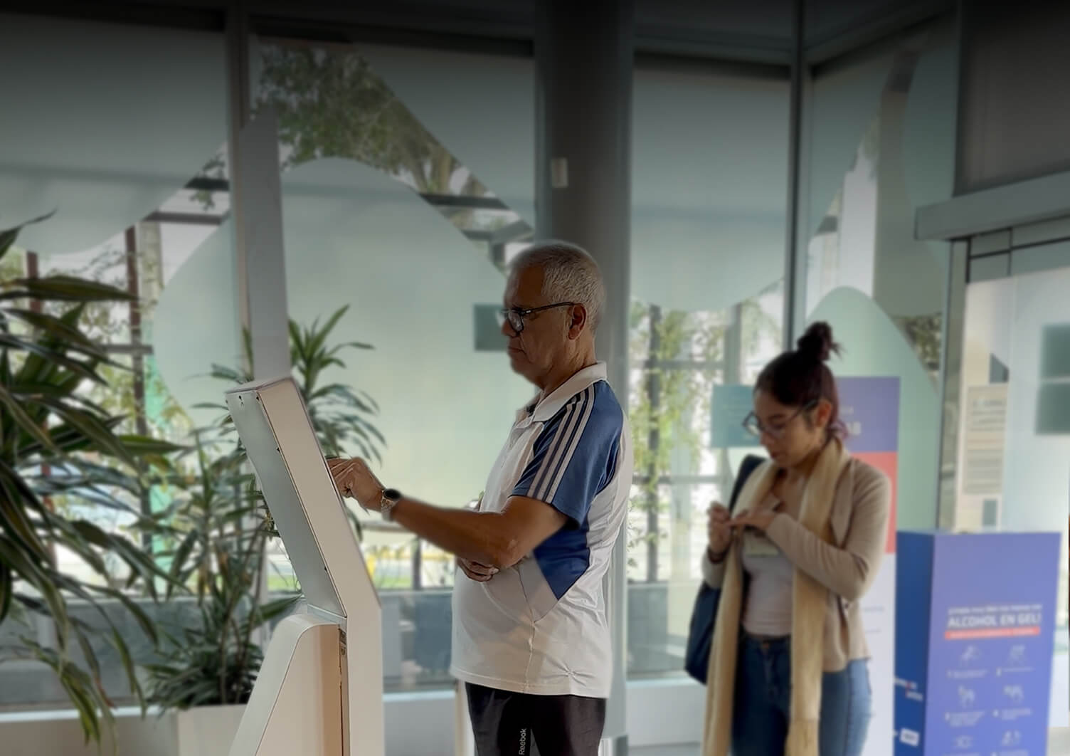
During field research, customers rarely approached the kiosk independently.
Most interactions started with a question directed at staff:
"How do I get my ticket?"
The system existed but people could not see it.

The challenge wasn’t the interface.
It was system legibility.

Human & System Insights
Field research revealed several behavioral patterns
Customers sought confirmation before acting
Many users hesitated before selecting options because they feared making mistakes or choosing the wrong service.
This hesitation increased reliance on staff guidance, not because the interface was broken, but because the system didn't signal it was safe to proceed independently
System logic was not visible
Customers often could not understand how the queue order worked, whether priority segments existed, or when their turn would be called.
The system's logic existed. It was simply not communicated. What users couldn't understand, they didn't trust.
Physical space influences interaction
Queue behavior is shaped not only by screens but also by spatial cues. Signage, screen visibility, and kiosk placement strongly influence whether users interact independently or ask for help.
The solution needed to integrate digital interfaces with spatial guidance not treat them as separate concerns.
Critical Path Design
Four areas drove the most iteration. Each one revealed a gap between how the system worked and how people understood it.
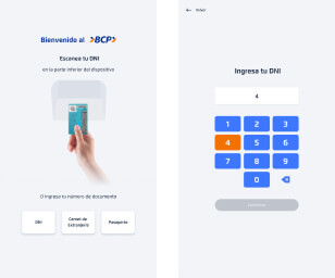
1. Identity Input: scanning vs. manual
Two interaction patterns were tested for user identification:
ID scanning and manual DNI input.
The initial hypothesis favored scanning it reduced typing effort.
Real-world testing revealed the opposite. 87% of users preferred manual input.
Users perceived typing as faster and more reliable than positioning an ID card for scanning in a public setting.
BEFORE
AFTER

DECISION
Prioritize manual input in the interface hierarchy. Keep scanning as a secondary option. Ease of use isn't defined by fewer steps. It's defined by the user's confidence in each step.
2. Kiosk flow: reducing cognitive load
The original flow required too many decisions in a high-distraction environment. Steps were reduced, instructions clarified for first-time users, and service selection simplified.
A digital education entry point was introduced as a strategic addition balancing short-term efficiency with long-term user enablement and adoption.
BEFORE
AFTER

IDENTITY
Enter DNI

IDENTITY
Enter DNI number
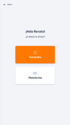
SERVICE SELECTION
Choose service

SERVICE TYPE
Choose service type

QUEUE
CONFIRMATION
Turn generated
IDENTITY
Enter or Scan DNI

SERVICE SELECTION
Choose service
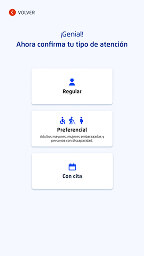
SERVICE TYPE
Choose service type

QUEUE
CONFIRMATION
Turn generated
DECISION
Reduce steps. Add one strategic entry point for digital education.
Fewer decisions reduce hesitation. One well-placed intervention drives long-term autonomy.
Before
Fragmented
Assisted Experience

After
Autonomous
Self-Guided Flow

3. Ticket & display: restoring trust in the queue
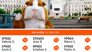
Users relied on ticket numbers to track their position, but the display didn’t reflect a linear queue. As numbers appeared to move backward, users believed they were being skipped.
This exposed a gap between system logic and user perception.
- Ticket numbers were removed.
- Service categories replaced numeric sequencing: “A” for advisory, “O” for operations.
- Turn calls were displayed name + service + counter, not sequence.
From system logic → human interpretation.
Before
Uninterpretable
numeric logic

After
Service-based logic
instantly understood

The redesign focused on making queue status understandable at a glance:
- Clear distinction between waiting and active turns.
- Stronger visual indicators for turn calls.
- Improved typography for distance readability.
Before
After

DECISION
Remove the number sequence. Replace it with service category, name, and counter.
When users can’t interpret the system, they stop trusting it. Clarity restores confidence and confidence removes the need for staff mediation.
4. Phygital Integration: Spatial System
Queue systems are not only digital interfaces. They are spatial and behavioral systems.
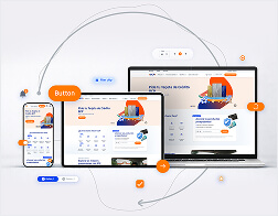
Digital interfaces were designed as part of a broader spatial system, developed alongside the Service Design team to coordinate behavior, orientation, and operational flow across the branch.
- Consistent visual language across kiosks and displays.
- Improved signage for turn registration.
- Clear spatial cues guiding customers through the branch.

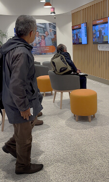
This alignment between digital and physical elements created a coherent end-to-end experience:
1. Requesting
a Turn
Immediate confirmation at the kiosk enabled independent interaction without staff assistance.

2. Ticket
Generation
A physical ticket reinforced transparency and gave users confidence in the process.

3. Transition to
Waiting Area
Spatial cues and signage guided users naturally toward display screens.

4. Turn
Awareness
Display screens communicated queue status in real time, enabling users to track progress without interruptions.
SCALABLE SYSTEM
After pilot validation, the system was prepared for deployment across 370 branches.
What made it scale wasn't documentation. It was that the core logic held across contexts.
Different branches had different spatial layouts, different staff configurations, different customer profiles.
The system absorbed that variation without requiring structural redesign because it was built on behavioral and operational coordination principles rather than interface specifications alone.
A system scales when its logic
is sound enough to survive contact with reality.
IMPACT AT SCALE
When the system became understandable, behavior changed.
70%
Autonomous
self-service
60%
Reduction In
Help Requests
87%
Preference for
Manual Input
370
Branches deployed
at scale
Metrics derived from direct observation during usability testing with 331 real users across pilot branches.
Strong adoption among older adults validated the accessibility-driven decisions.
The system was deployed across 370 branches while maintaining operational consistency across different physical layouts, service configurations, and user profiles.
FINAL INSIGHT
When the logic of a system is invisible, people depend on other people to navigate it.
When the system becomes understandable, people organize themselves.
The redesign didn’t just improve an interface. It restructured how people understand, navigate, and operate within a physical service environment.
Queue systems are not operational tools. They are behavioral systems that shape how people move, decide, and trust.