CONTEXT, CONSTRAINTS & GOALS
CONTEXT
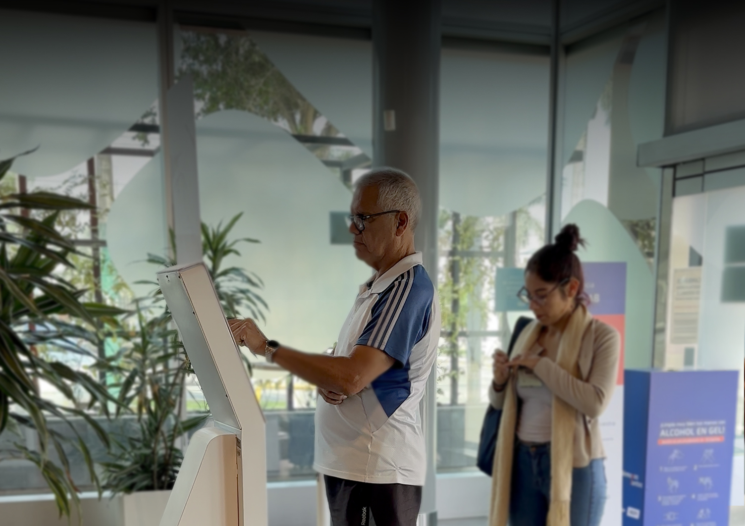
Physical bank branches operate as complex service environments where customers navigate multiple services, queues, and interaction points.
However, queue management in many branches is not structured by systems it is mediated by staff.
Customers frequently depend on employees to understand:
- Where to request their turn.
- Which service to select.
- When they will be called.
- Which counter they should approach.
This dependency increases operational workload and creates friction in the customer experience.
At scale, the issue was not simply interface design it was how the system communicated its logic to people inside the physical space.
CONSTRAINTS
The redesign had to operate within several real-world constraints:
- Enable customer self-service for turn registration.
- Reduce staff involvement in queue management.
- Improve clarity of the queue system.
- Standardize the experience across branches.
- Reduce operational workload in physical agencies.
The solution needed to improve clarity without increasing operational complexity.
Business Goals
The project aimed to:
- Enable customer self-service for turn registration.
- Reduce staff involvement in queue management.
- Improve clarity of the queue system.
- Standardize the experience across branches.
- Reduce operational workload in physical agencies.
The system was eventually deployed across 370 bank branches.
Role & Scope
- Field research inside branches.
- Behavioral analysis of queue interactions.
- Definition of the turn management system.
- UX design of kiosk interaction flows.
- Design of turn display interfaces.
- Service design for the physical queue experience.
- Usability testing and pilot validation.
- Implementation handoff and rollout coordination.
The work combined Human-Centered Design, HCI, and service design.
THE KEY SHIFT
At first, the problem looked like an interface issue.
Customers were struggling to use the kiosk system.
But the real issue was not usability alone.
It was system visibility.
Customers could not easily understand how the queue worked, and as a result, the interface itself became difficult to interpret. Without that understanding, the system defaulted to human mediation.
Staff became the only interface users could trust.
The design challenge was not simply improving the kiosk UI.
It was making the queue system legible to people.
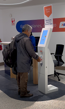
During field research we observed that customers rarely approached the kiosk independently.
Most interactions started with a question directed at staff:
“How do I get my ticket?”
The system existed, but people could not see it.

The challenge wasn't redesigning a screen.
It was making the queue system understandable inside a physical environment.

Human & System Insights
Insight 1: Customers seek confirmation before acting
Many users hesitated before selecting options because they feared making mistakes or choosing the wrong service.
This hesitation increased reliance on staff guidance.
Insight 2: System logic was not visible
Customers often could not understand:
- How the queue order worked
- Whether priority segments existed
- When their turn would be called
The system’s logic existed, but it was not communicated clearly.
Insight 3: Physical space influences interaction
Queue behavior is shaped not only by screens but also by spatial cues.
Signage, screen visibility, and kiosk placement strongly influence whether users interact independently or ask for help.
The solution needed to integrate digital interfaces with spatial guidance.
Critical Path Design — DESIGN ITERATION
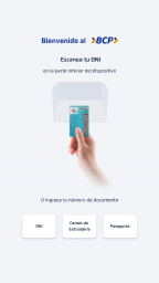
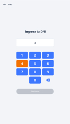
1. Critical Decision: Identity Input
Two interaction patterns were evaluated for user identification:
- ID scanning
- Manual DNI input
We initially expected scanning to dominate, as it reduced typing effort.
However, real-world usability testing revealed the opposite.
87% of users preferred manual input.
BEFORE
AFTER
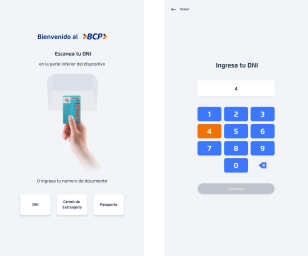

Users perceived typing as faster and more reliable than positioning the ID for scanning in a public setting.
This insight led to prioritizing manual input in the interface hierarchy, while keeping scanning as a secondary option.
2. System Simplification: Kiosk Flow
The kiosk flow was redesigned to reduce cognitive load and enable faster decision-making in high-distraction environments.
A new digital education entry point was introduced as a strategic addition, balancing short-term efficiency with long-term user enablement.
Key improvements:
- Reduced number of interaction steps.
- Clearer instructions for first-time users.
- Simplified service selection.
Strategic addition:
- Introduced a digital education entry point to drive long-term user enablement and adoption.
The result was a more direct and predictable flow, reducing hesitation and enabling faster task completion in high-distraction environments.
BEFORE
AFTER
IDENTITY
Enter DNI
IDENTITY
Enter DNI number
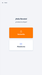
SERVICE SELECTION
Choose service
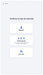
SERVICE TYPE
Choose service type

QUEUE
CONFIRMATION
Turn generated
IDENTITY
Enter or Scan DNI

SERVICE SELECTION
Choose service
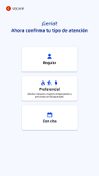
SERVICE SELECTION
Choose service type

QUEUE
CONFIRMATION
Turn generated
Before:
Fragmented & Assisted Experience
After:
Autonomous & Self-Guided Flow


3. System Coherence — Ticket & Display
The queue system required clear mapping between digital interaction and physical experience.
Printed Ticket: Restoring Trust in the Queue
The original ticket system created confusion and mistrust.
Users relied on ticket numbers to track their position, but the display system did not reflect a linear queue.
As numbers appeared to “move backward,” users believed they were being skipped, even when the system was functioning correctly.
This revealed a critical gap between system logic and user perception.
Instead of reinforcing a flawed mental model, the solution redefined how the queue was communicated.
- Ticket numbers were removed.
- Service categories were introduced (e.g. “A” for advisory, “O” for operations).
- Turn calls were displayed using name + service + counter, not sequence.
Before
After
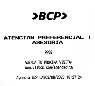
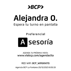
This eliminated the need for users to interpret queue progression, reducing confusion and restoring trust in the system.
Turn Display: Queue Legibility
The display system was redesigned to make queue status understandable at a glance.
Changes included:
- Clear distinction between waiting and active turns.
- Stronger visual indicators for turn calls.
- Improved typography for distance readability.
- Better mapping between screen information and service counters.
This enabled users to track their progress independently, reducing reliance on staff assistance.
Before
After


4. Phygital Integration: Spatial System
Queue systems are not only digital interfaces.
They are spatial and behavioral systems.
The physical environment was redesigned to reinforce system logic across the entire experience.
The solution introduced:
- Consistent visual language across kiosks and displays.
- Improved signage for turn registration.
- Clear spatial cues guiding customers through the branch.

This alignment between digital and physical elements created a coherent phygital system.
Customer Journey: End-to-End Experience
Customers moved through a unified system that connected interaction, confirmation, and awareness:
1. Requesting
a Turn
Immediate confirmation at the kiosk enabled independent interaction without staff assistance.

2. Ticket
Generation
A physical ticket reinforced transparency and gave users confidence in the process.
3. Transition to Waiting Area
Spatial cues and signage guided users naturally toward display screens.

4. Turn
Awareness
Display screens communicated queue status in real time, enabling users to track progress without interruptions.

SCALABLE SYSTEM
After pilot validation, the redesigned system was prepared for large-scale deployment.
The rollout required:
- Design documentation for engineering teams.
- Interaction specifications.
- Operational guidelines for branch staff.
- Coordination with technology and operations teams.
The system was implemented across 370 bank branches, creating a standardized queue experience.
IMPACT AT SCALE
The redesigned system significantly improved both customer autonomy and operational efficiency.
Customer Autonomy
70% Self-Service Completion.
Most users were able to request their turn independently.
Operational Efficiency
60% Reduction in Staff Assistance.
Staff intervention decreased significantly after the redesign.
Behavioral Metrics
69.79% of users completed the process entirely on their own.
Staff assistance reduced to 20.54% of interactions.
Only 9.67% required partial assistance.
Accessibility
The system showed strong adoption among older adults, validating the accessibility decisions made during design.
FINAL INSIGHT
Queue systems are often treated as operational tools.
But they are fundamentally behavioral systems.
When the logic of a system is invisible, people depend on other people to navigate it.
When the system becomes understandable, people organize themselves.
The redesign did not simply improve an interface.
It restructured how people move through a physical service environment.


